In the Studio: Color Work
Behind the Scenes: Color Work for ‘Here Comes the Bride’
As I mentioned in my last blog post, I’ve been deep in color work for the new ‘Here Comes the Bride’ collection. So I thought I’d give you a little behind-the-scenes peek at how I build my color palettes—it’s one of my favorite parts of the process.
Once I narrowed down the color schemes (not an easy task, by the way), I started mixing up the actual hues I’d need for each subcollection. Since I work exclusively with professional acrylics, this means a lot of testing, tweaking, and remixing until I get just the right shade. This part has to happen before I ever touch a canvas, but it’s still very much part of the creative process. Watching the colors interact, shift, and settle in next to each other is its own kind of art. And it often sparks new ideas for future work!
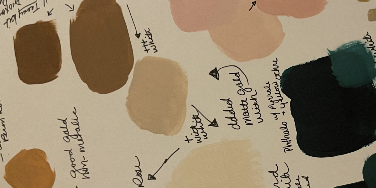
I kicked things off with the ‘Emerald Isle’ palette—deep, rich emerald greens with some lighter tints, paired with custard white, heirloom brass, blush pink, and metallic gold. Once I’ve mixed a hue I love, I jot down the “recipe” on a color card. This is a system I came up with after way too many times trying to recreate a color I loved and getting nowhere close. Hours of frustration and wasted paint later, I finally learned my lesson (it still makes me a little sad).
Once the recipe cards are done, I like to play around with any leftover paint. I mean… it’s already there, it’s gorgeous, and it’s mixed—how could I not? That little bonus playtime often leads to something fun or unexpected.
Next up was ‘French Lilac’—a palette of warm white, sage, earthy greens, and soft steel gray that pairs beautifully with the purples. Since this collection is called ‘French Lilac’, I went with purples that have a red undertone, giving them a warm, romantic vibe. Purples can be tricky—probably because I fall in love with every single variation before landing on the one I’m actually after. True to form, this one took me down a rabbit hole. Again.
What I didn’t expect? That I’d totally interrupt myself and detour into a 3-piece mini collection called ‘On A Whim. (You can check it out here.) It may have nudged my timeline for ‘Here Comes the Bride’, but honestly? No regrets. It was worth it.
Next on the docket is ‘Pantone’s 2025 Color of the Year: Mocha Mousse’—and oh my goodness, what a dreamy shade. I’m pairing it with muted, earthy pinks, deep wine tones, woodsy greens, a cool buff white, and brassy gold. It feels grounded but super luxe.
After Mocha Mousse, I’ll be moving into ‘Summer Sorbet’, and finishing off the collection with ‘Red Ever After’—but I’ll save those juicy details for another day.